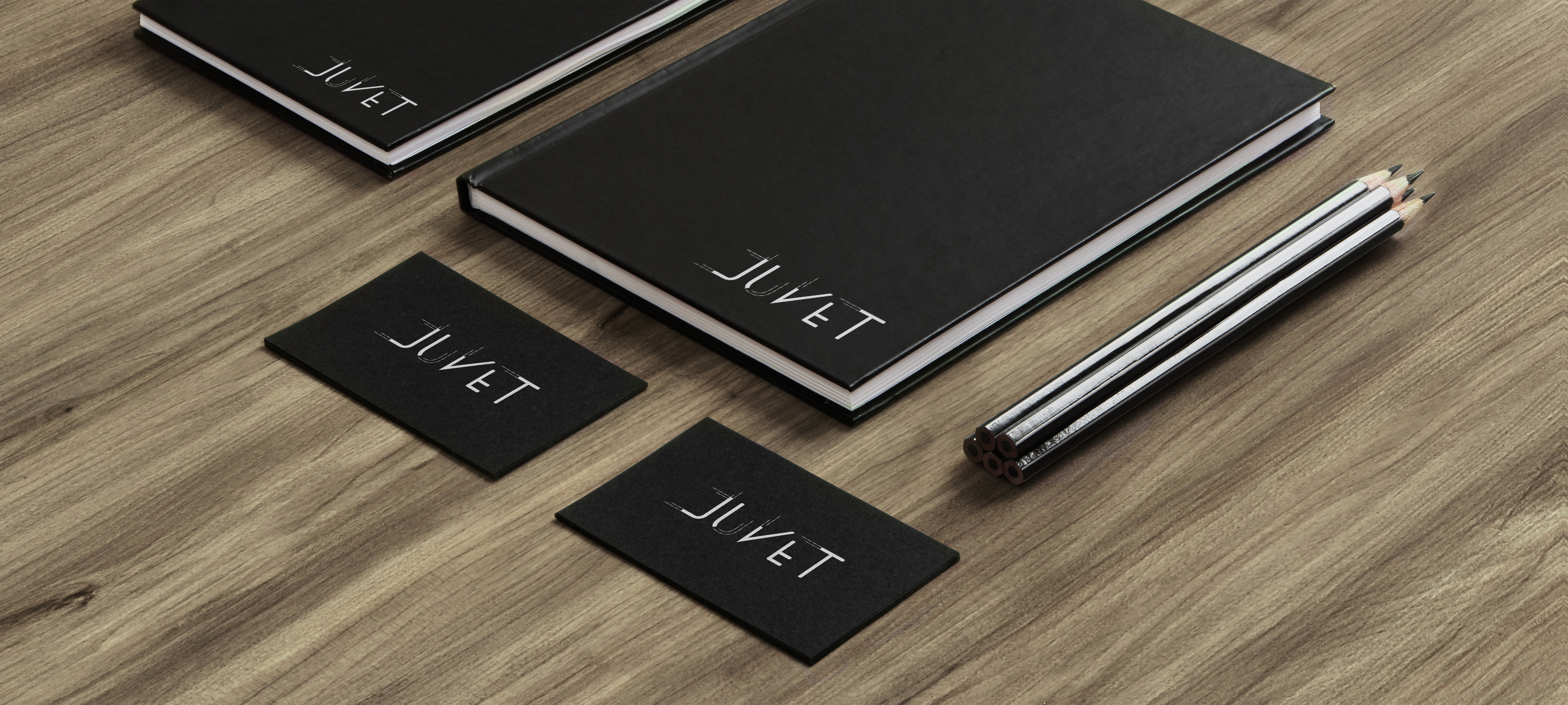
Juvet Hotel Logotype
Background
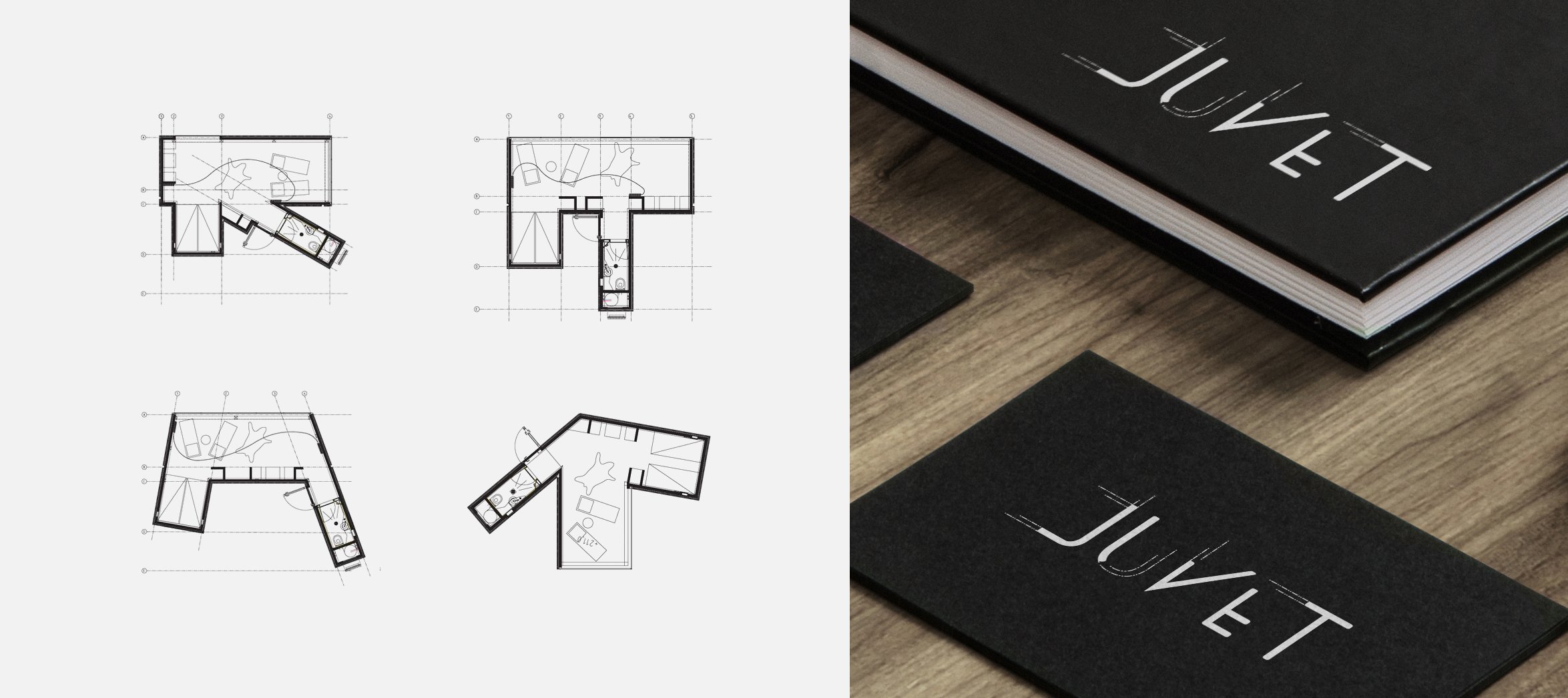
Located in Valldal, Norway, the Juvet is built on a nature reserve and is credited as Europe’s first landscape hotel. The hotel is split into nine separate units; each boasts its own individualized floor plan and unique view. The Juvet’s owner, Knut Slinning, is deeply invested in nature preservation; special architectural accommodations are made to ensure that the original landscape and terrain remains unaltered.
The Juvet’s units are built on steel stilts, which make it possible to erect structures that can be easily removed; the stilts also make it possible to build structures without requiring any rock blasting. Juvet unit floor plans, meticulously planned around rocks and trees, wholly accommodate surrounding terrain. Norweigen architectural advancements allow the Juvet to sustainably occupy its organic surroundings, to respect forces that precede and succeed its existence.
Solution
The Juvet’s updated logotype celebrates the units’ modern engineering. Angles taken directly from the Juvet’s floor plans are blended with Univers, a Scandinavian typeface. While Univers lends the logotype its weight and consistency, the Juvet’s lines and angles, taken from Juvet’s technical drawings, converts the Juvet logotype into a proprietary mark specific to the hotel. To pay further homage to the Juvet’s location and architectural roots, the logotype's color is matched to the navy hue found on the Norwegian flag.
Very few hotels compare to the Juvet experience; Knut Slinning hopes patrons remember the Juvet as the place “where nature and modern design bring out the best in one another.” The Juvet’s architecture is key to delivering the experience Slinning desires and makes it possible for the hotel to uphold strict sustainability standards. The goal of the Juvet logotype project was to deliver a mark that aligns with the Juvet’s owner and architects’ forward thinking.