Charlotte Brewing Labels
Background
In an effort to forget war horrors and establish fresh roots, Fritz and Charlotte Sperling immigrated to Michigan City, Indiana in 1929. Fritz managed to find work and provide for his family; Charlotte raised her children with care and acted as the Bocker family matriarch for generations.
Fritz and Charlotte brought with them German traditions, which eventually melding into new traditions they created together with their family. It was commonplace for Fritz to call for his children in the evenings; in tandem, the family would gather to play various card games.
The tradition of gameplay and competition continued, passing through several generations; each peer group added onto or created their own game renditions. The games evolved with each family member and became narrative snippets of each individual’s journey. Some games were learned in Vietnam trenches, others in the college dorm rooms, a select few in casinos; all were eventually brought to the family table at reunions and gatherings.
With the children all grown up, drinks became as pivotal to gameplay as the cards; beer was a sign of celebration, joviality, and laughter – a good time.
Solution
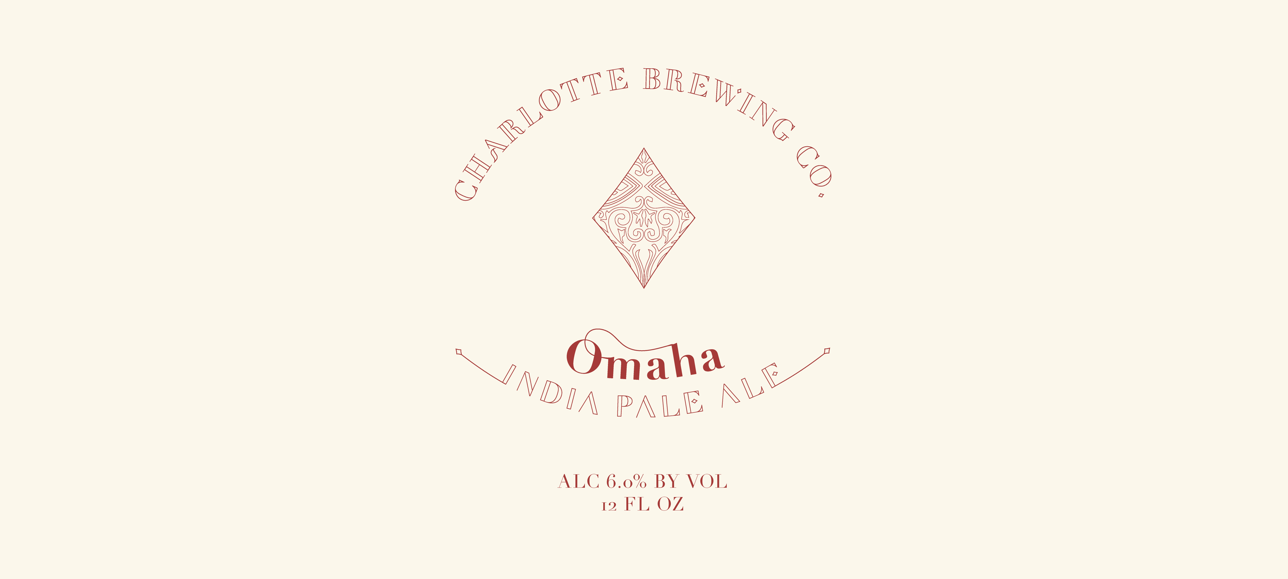
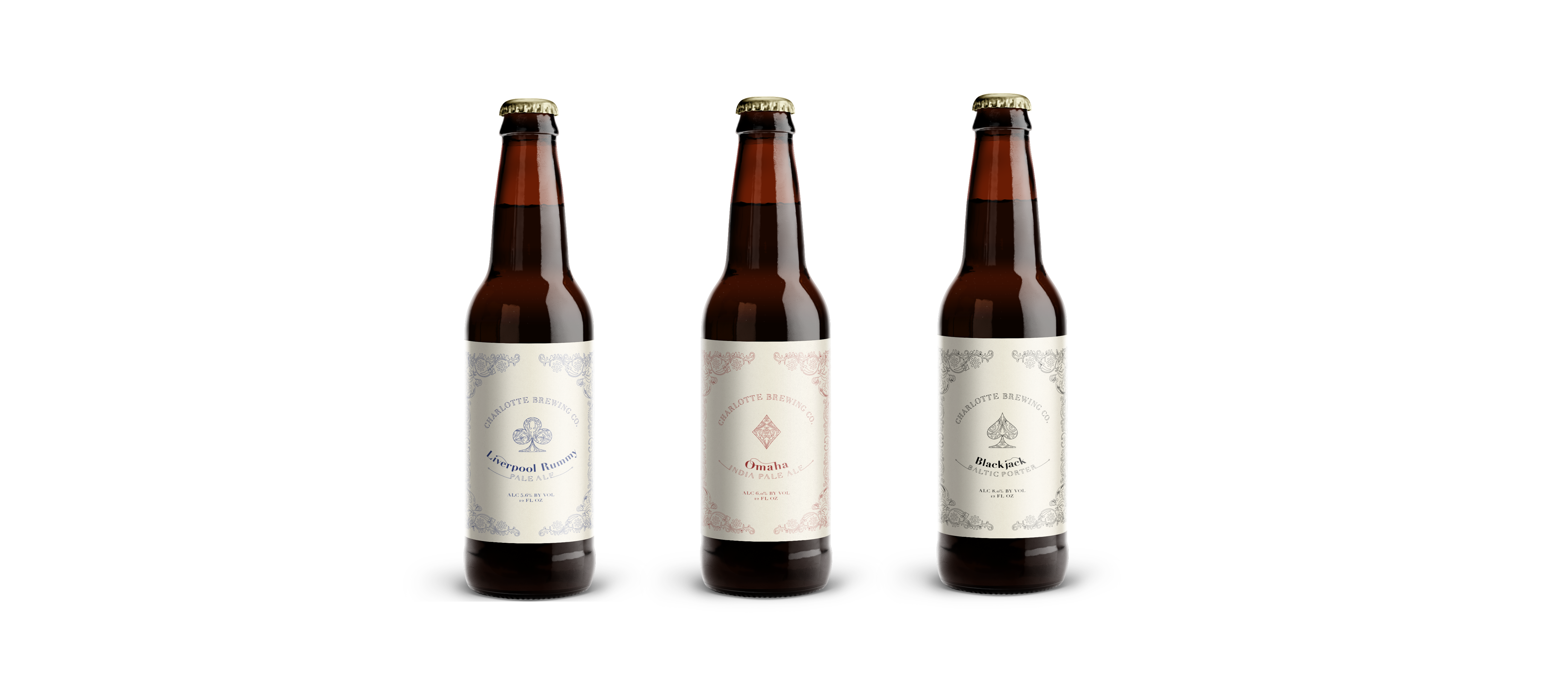
Charlotte Brewing Co. labels feature a classic card back design pattern, alluding to the culture of gameplay; the label design is printed on a textured paper that mimics the texture found on playing cards. Each label features a predominate card game or variation: Omaha, Blackjack, and Liverpool Rummy.
Red, black, and blue are traditional card suit colors; as a result, the labels draw their color palette from vintage decks. Didot, a typographic staple, was chosen as the base typeface for the logotype and variation descriptor. The typography is elegant and sophisticated, but playful ligatures and crossbar variations add an element of playfulness.